 Hey, I recently reviewed a book on Cisco Packet Tracer, book is published and available for sale now, here is the link http://bit.ly/1eghb4p.
Enjoy!
Hey, I recently reviewed a book on Cisco Packet Tracer, book is published and available for sale now, here is the link http://bit.ly/1eghb4p.
Enjoy!
I would like to start this entry with a whoop-de-Doo and a big hurrah! My OPW internship with Gnome Responsive project is finally over 😀 (although my work is not 😉 ). The three months altogether marked an incredible journey, and especially the last one went by like a flash(work sleep eat work… :P). After the GUADEC trip, I was more than excited to continue the work on the main website http://www.gnome.org after getting a lot of technical and design inputs from my mentors Andreas & Fabiana, Allan, Garret etc. and after various discussions on different design aspects of the website, all of the pages have now been made responsive.
The website now uses Bootstrap(12 column grid) responsive framework. This is in consistency with the OPW: www.gnome.org/opw website which also uses the same framework and is responsive now.
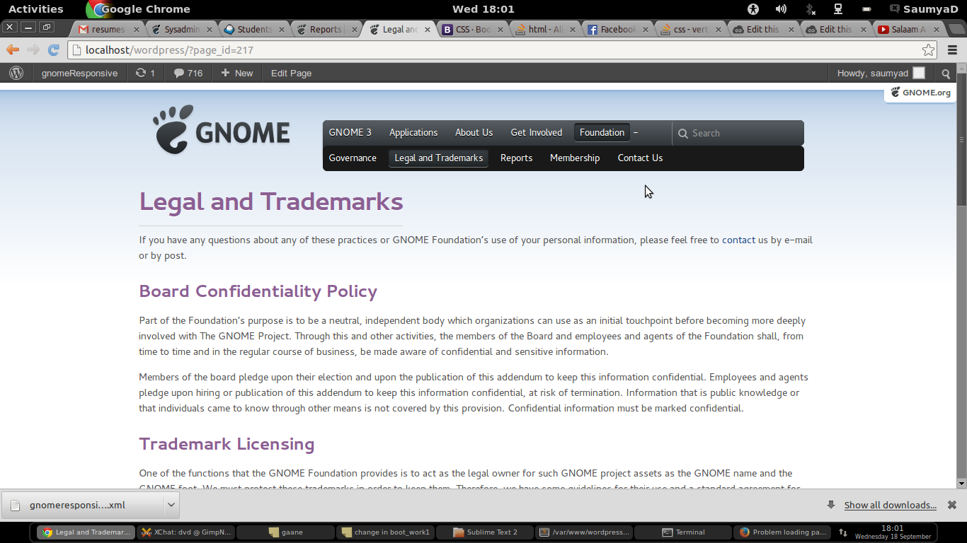
A proper responsive navigation is at place (screenshot attached for various devices) and design is consistent with the current navigation structure. The sub-menu structure in Gnome Foundation has been dissolved and everything is now accessible via the main navigation menu. Breadcrumbs have been added to make the navigation process even easier. There have been some more changes in the design, most of which are view-able in smaller screens (< 768 px).


The Testing-Found a bug-Again testing-Found a bug again phase is on and there are a few minor changes to be done before it is finally committed onto the main website(too excited for that!). And at last, but obviously not the least I would like to thank my mentors Andreas Nilsson and Fabiana Simoes for all the help and support they have given me throughout the project. I would also like to thank Andrea Veri for bearing with the web development team the entire time we were stuck with VPN and testing instances 🙂
Now that very few days are left before my OPW internship gets over, the project is also reaching its final stages. Most of the pages have been made responsive and proper navigation menu is at place. But that does not mean that my work is done! 😀 . I have yet to make everything live and and see the response this responsive website creates. My mentors simultaneously are giving a thorough look at my work and shooting me with feedback and reviews. It feels like a great long journey has ended but still a larger part of it is left! Meanwhile I am also planning to take up and contribute to some other similar (Gnome) project, so that I utilize my experience with website design and responsive systems as much as I can and continue contributing 🙂
I have been recently working on making the main gnome website responsive and meanwhile have been cleaning some existing code and templates. Since the entire framework is being shifted from Grid 960 to Bootstrap, there is a lot of work to do. In GUADEC 2013 web hackfest, there has been some discussion on the redesign of the website — basically the welcome note and the menu bar — but since nothing has been finalized as of yet, I am continuing with the existing design. My strategy is to go page by page ( and eventually fix one template at a time according to the new framework) and finally merge in the menu and content redesign, if there is any.
I forgot to mention in my previous blog about the wonderful Women’s dinner, welcome dinner at Fleda and the exciting guided tour around Brno. Each and every event was a celebration in its own way and cheers to Red Hat, Mozilla and Igalia for sponsoring such events.

The core conference days were over on 4th and we took a breath to discover more and travel more. We went to Prague for a one day trip and met more people and explored the beautiful and heroic history of the city(our tour guide was awesome! ;)).
The next day were scheduled marketing and web-development hack fest. I worked with my mentors Andreas and Fabiana, Andrea V, Allan, Garrett and many more people on my project and had intense discussions on the related topics. The day ended with a low lingering feeling that it was the my last day and it is time to go back. We bid farewell to our mentors and other present fellow attendees and took the flight back to India.
P.S. It was sometimes difficult to search for a vegetarian place to eat at , but apart from that it was a fun-filled journey.
I am really grateful to Gnome Foundation for funding my travel and all the organizers for putting together such a wonderful conference.
What an eventful week it has been! Going through the hassles of getting a visa and a tiring 15 hour journey finally paid off as I landed in Vienna, Austria and took off to Brno, Czech Republic – the venue for GUADEC conference this year. Apart from this being my first GUADEC, it was also my first trip outside of my country. It was all exciting and surreal- new places, new people and new memories!
I started with volunteering on the day before the core conference days started, fun working with the other organizers and other smiling faces! Once the conference started, the next few days went super fast as we were busy attending the talks and meeting so, so many new people! It is so amazing that how all of my statements are ending with an exclamation mark but that is how exciting each and every part of the journey was!
Will keep you updated!
The last three weeks have been full of excitement and happenings and due to this busy schedule I have not been able to update this wall recently. To get started with a bang, the opw site is now responsive (www.gnome.org/opw)!. My experiment with responsiveness started with using adapt.is written by Nathan Smith. It is of course lightweight and felt like a perfect solution for a relatively simple website of OPW. However the major issue was to maintain a single framework for responsiveness across all Gnome websites to maintain uniformity. Gnome main website is not as simple as the OPW one and is also based on WordPress. A proper framework would make the work simpler and propose standard solutions(instead of preparing your own CSS file for every device size and loading it accordingly with adapt.js). Bootstrap felt like an intuitive solution because of its customization features, ease of use and large development and user community available. Once the normal framework responsiveness is achieved, there is no doubt required a lot of tinkering and adjustments here and there to achieve exactly what you want and there is always somebody out there to help you with some awesome tricks!
The OPW site is now responsive and the next thing is the main gnome website! #excited
As part of GNOME Outreach Program for Women 2013, my project is responsive design implementation of GNOME main website. I wrote an article summarizing my research work of the past few weeks .It describes what responsive design is and how it could be achieved.
What is Responsive Design?
Responsive web-design is a technique which essentially uses Cascading Style Sheets 3(CSS3 media queries with fluid proportion-based grids, to adapt the layout of the website to the viewing environment (that is, the device it is viewed in) and minimize user adjustments of resizing or scrolling.
The term responsive web design was originally coined by Ethan Marcotte in an article on A List Apart in the year 2010. In his words, “Responsive design is not a single piece of technology, but rather a set of techniques and ideas that form a whole.”
Need of a Responsive website:
Mobile phones will overtake PCs as the most common Web access devices worldwide by 2013, according to a forecast by research firm Gartner(“2013 Gartner Tablet Forecasts”). For the first time since 2001, in 2012 PC sales were projected to be lower than they were in the previous year. Before responsive design came in, the solution was to create a mobile version of your site, but the solution is useless when you have a large number of available screen sizes- you cannot keep creating a website version to accommodate each of the devices.
To make a website consistent across all devices, it is better to have a single responsive stylesheet than having its separate mobile and desktop versions. Not only does it help them keep costs down, but it also ensures that their websites will be compatible with the recent and future trends.
2013 is being dubbed as the year of responsive web design. Responsive designs solve the problem of making a website work for the endless number of new devices and resolutions being used to access the web.
In words of Jody Resnick, CEO of Trighton Interactive – “With a responsive website, businesses can be in front of consumers at every step of their online journey. People who search for a business’ site, begin reading content and viewing videos from their desktop computers at work, and then look for the same business on their smartphones during lunch are able to continue their research into products and services uninterrupted.
“In contrast, if the business has a traditional website and a mobile site, someone investigating products and services online can become frustrated by the lack of complete content on the mobile site or the inability to navigate through the full site on her smartphone. She might give up the search altogether,” Resnick warns.
“Responsive websites provide continuity between different viewing contexts, remaining completely agnostic to the type of device used and the size of the screen it has. What this means is that the same website will present an optimized layout regardless of which device it finds itself being loaded in.”
Responsive websites simplify internet marketing and SEO. Instead of having to develop and manage content for multiple websites, businesses with responsive sites can take a unified approach to content management because they have only the one responsive site to manage. The same applies to analytics and strategy development and deployment. A responsive website means there is only one set of analytics to examine and a single strategy to develop and deploy.
“In addition, responsive websites are easier for consumers to find than traditional or mobile sites because they come up higher in search engines’ rankings,” explains Resnick. “In fact, Google recommends responsive web design because having a single URL for desktop and mobile sites makes it easier for Google to discover content and for Google’s algorithms to assign indexing properties to content.”
Framework and technologies
CSS3 media queries :
CSS Media Queries are a feature in CSS3 which allows you to specify when certain CSS rules should be applied. This allows you to apply a special CSS for mobile, or adjust a layout for print. Style sheets with media queries attached to their <link> tags will still download even if their media queries would return false (they will not apply, however).
Example : < Another blog on this >
Media queries do more than just define different font sizes. Often, you will actually move entire sections of the page depending on the available screen real estate. For example, using a three-column layout might look good on a laptop screen, but it won’t work on a small device like a smartphone. In this case, you might want to move one or more columns or elements on the page to adjust to the available space
Frameworks : Using an existing framework reduces the initial work as they promote grid based design and deal with cross browser compatibility issues. Such frameworks cover all bases and you do not need to start from scratch. It ensures you have the responsive grids setup in a standard and best practice fashion, which saves your time for coding and testing. It further allows you to focus on the specific design and content needs for the website.[http://www.awwwards.com/what-are-frameworks-22-best-responsive-css-frameworks-for-web-design.html ]
The trend now seems to be either creating custom fit for purpose responsive layouts or using Twitter Bootstrap
Twitter Bootstrap : http://twitter.github.io/bootstrap/
12 column responsive grid
endless components: Dropdowns, buttons, button groups, button dropdowns, thumbnails, typography, media objects progress bars, alerts and many more,
JavaScript tool-kit or individual plugins
download customization to take only the most important
Helium is a frontend responsive web framework for rapid prototyping and production-ready development using HTML5 and CSS3. In many ways it is similar to both Twitter Bootstrap and ZURB Foundation but is designed to be much more lightweight and easier to play with.
Other frameworks:
Additional Libraries: These libraries can enhance the look and feel of your responsive website.
The ultimate key is to keep it simple, in the early stages of Responsive website development – making only fluid text and images and once the basic design is done find the specific points where you can improve the media queries and implement the above said options.
Testing Responsive Design
(Firebug and chrome developer tools extension) : Using this you can not only alter the screen sizes, but also can configure the browser to emulate as ‘handheld’ media , ‘print’ media etc.
RESPONSIVE DESIGN IMPLEMENTED:
BOSTON GLOBAL : Largest responsive website to date. It does a wonderful job of presenting an extremely rich and varied collection of data in a clean, pleasant and consumable format across devices.
SMASHING MAGAZINE : The website expands beautifully on maximizing and adjusts the content accordingly.
FOOD SENSE: Clean looks, use of bold and big fonts, easier to navigate and pleasant to the eyes .
Challenges:
With responsive design the HTML is the same for every visiting device and each time a page loads on mobile it also loads all of the HTML elements including images & scripts intended for the tablet and desktop sites. Every time a user visits your site they download the full page content by default – no matter which device they are using.
The kind of CSS we use should ensure that the information which is more relevant should be more easily accessible to the user.
These challenges are addressed in the article http://socialdriver.com/2013/06/10-tips-for-web-designers-designing-responsive-websites/. Establishing a good content hierarchy and CSS optimization with tools like Sass can help.
Good Tutorials
http://www.onextrapixel.com/2011/09/12/create-a-responsive-web-design-template/
http://socialdriver.com/2012/06/a-responsive-web-design-tutorial-for-beginners/
http://www.jannahagan.com/2012/05/responsive-web-design-resources-for-absolute-beginners/
Other Useful References:
http://en.wikipedia.org/wiki/Responsive_web_design
http://www.netmagazine.com/features/ethan-marcottes-20-favourite-responsive-sites
http://webdesignerwall.com/tutorials/5-useful-css-tricks-for-responsive-design
http://www.tripwiremagazine.com/2013/06/responsive-wordpress-themes.html#frameworks
http://www.adobe.com/inspire/2013/02/responsive-web-design.html
http://www.hongkiat.com/blog/rwd-tools/
http://www.jannahagan.com/2012/05/responsive-web-design-resources-for-absolute-beginners/
http://blog.teamtreehouse.com/beginners-guide-to-responsive-web-design
http://www.hongkiat.com/blog/rwd-tools/#jquery
https://developer.mozilla.org/en-US/docs/Web/Guide/CSS/Media_queries
 saumyazero